Haibu
|
Haibu is a concept of a service completed by a group of Hyper Island students, including me and Ryo. It invites lecturers and students to use their mobile devices in the classroom to make education more up to date, productive and fun |
Challenge
ProcessSix Hyper Island students teamed up to research, come up with a idea, test it, produce designs and deliver the concept.
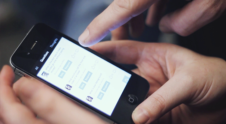
The concept is now ready for implementation. We are looking for a way to kickstart this project. ConceptImagine having a second screen experience not with a TV, but with a powerpoint-based lecture. A student is allowed to use her phone with a Haibu app, which receives a second screen information based on what happens on the first screen, where lecturer has his main presentation.
Students benefit from having an extra layer of content, have a way to ask questions and bookmark useful references along the lecture. And the lecturer has an ability to track the usage of Haibu app and draw attention when he needs it. Finally, the lecture becomes truly interactive, involving students to contribute, ask and discuss, during or after class. We believe, this conversation has ability to push education to a new level. Technical Implementation
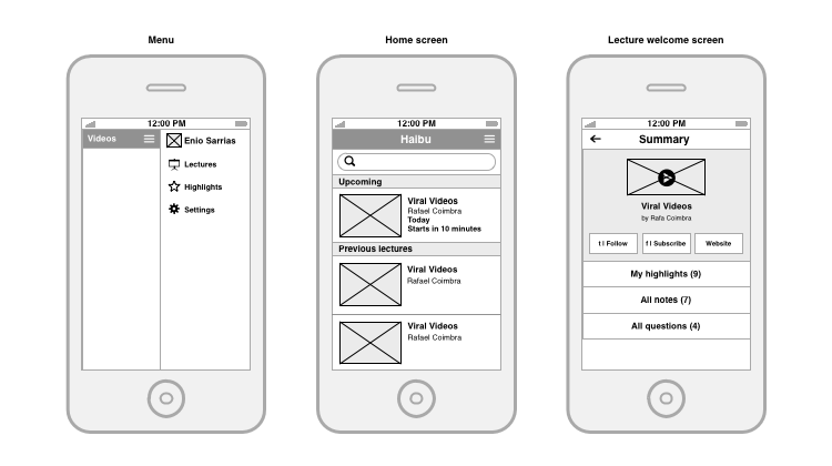
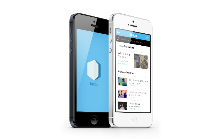
Prototyping and User ResearchTo make sure Haibu will be accepted and enjoyed by people, we interviewed several lecturers and conducted a usability research with real students. We made wireframes for the app, filled them with the real content and then ran the presentation. We observed the process and collected the feedback after the test, which made us come up with several changes to Haibu concept and execution. Identity and Visual DesignAs the concept has been proven with tests, we completed branding for Haibu and a set of screen designs for the app. We wanted Haibu to be perceived as modern and fun educational experience, so we decided to focus on the content and make the design flat and minimalistic. ResultsThe main goal we had before us was raising a discussion about usage of mobile devices in the classroom. We really believe it was time to take a step forward in the lecture room education and make education a bit more interactive and up-to-date. Haibu was a Hyper Island student project, which helped us as a group of six people understand a lot about group dynamics and project management. One of the best outcomes was that during the project me and Ryo Takahashi decided to team up as a creative duo. We continue building innovative digital concepts and putting them into convincing stories. |


