Afisha’s Best in Moscow
|
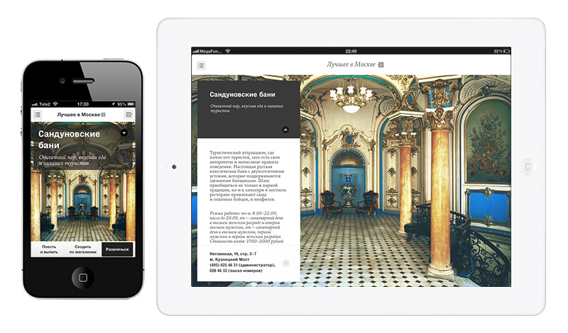
Best in Moscow is an illustrated digital guide to the best places and activities in the capital of Russia, according to the editorial staff of Afisha Magazine. |
 ChallengeAfisha Magazine, a leading Russian entertainment media, decided to create a beautiful digital guide to Moscow for the locals using the magazine’s expertise. ProcessWe stared with research to confirm our initial thoughts and viability of an idea and then went into rapid prototyping and testing, followed by visual design and development. I was directly involved in prototyping and concept testing.
ConceptWe decided to think differently about city guides. What if instead of thousands of puzzling options we would just come up with top hundred best places to go in the city, which the locals would appreciate as much as the editorial staff? And to make a choice even easier we could use an amazing picture of something that would represent one main thing about each place. So while one restaurant could be praised for its food, the other would remembered for its athmosphere and interiors. ResearchAs we defined the key opportunities, we started to look at our target audience, their behaviours and habits. We understood that most people we want to reach are between 25 and 50, living in Moscow and having easy time getting to downtown during the weekends. They like dining at good places, visiting galleries and having good time in city parks, having pretty much the same interests as Afisha’s staff.
Interaction design and concept testingTo test our idea we proceeded by making a set of rapid prototypes to understand how people’s choosing behaviour would match our idea. We also wanted to test information architecture for the app and to find out extra needs that people would express while using the guide.
While user testing with protoypes proved some ideas are worthy, while some of the initial features were rather confusing. By interatively changing the prototype and testing it we came up to final set of wireframes.
Visual designWe continued to develop app’s visual identity to sharpen its look and feel. Photographs were a big part of a visual communication, so photographers visited each place and took amazing pictures that could represent its essence. It made Best in Moscow a very visual digital guide for the city. Results
|


